Content creation and accessibility
The Accessibility strategy is to ensure that all parties are involved in work on Ísland.is working together to improve accessibility for all users of the website.The Content strategy is to ensure that everyone create content in a standardised way.
Table of contents
Content Strategy
The purpose of the content strategy is to ensure quality content and navigation through the site for the users. This helps both the users and the service providers.
A good informational website needs to meet the following three conditions:
1. The information needs to be there
1. Information on governmental services or instructions that help people complete what they need to do
For example:
information on child benefits
marriage rights
application for maternity/paternity leave
This content should be in the primary navigation system of Ísland.is.
2. Information on governmental institutions
For example:
purpose and role
location and opening hours
news
events
This content should be on the institution pages.
The purpose of content research is to establish:
Who the users are
What they need from you (test any assumptions you have about what the user needs)
How to talk to them
Who are the users?
If we can't get reliable statistics on the user group, discussions on social media and bland.is to get a sense of the user group.
If the user group in question is for example people with disabilities, it can be helpful to draw on knowledge from organizations.
What do they need?
What questions are people asking the helpdesk? It is helpful to collect these questions and use them to write content.
What social media discussion groups exist on the subject?
What are people asking about in online discussions and chat groups?
What answers do people give? Are people giving the correct answers, or is the discussion at odds with reality?
How to talk to people?
Consider the vocabulary people use, for example on Bland or social media when talking on the subject
Have a look at the statistics
very few page visits may indicate a discrepancy between the vocabulary on the page and the vocabulary used by people
can indicate that people are accessing the wrong page, let’s look at what’s causing the problem.
let us be aware that a high bounce rate can indicate that the page is fulfilling its purpose very well, that people find the information they need, and then leave
what are people clicking on
if people spend long periods of time on pages with a clear function (Call To Action), this might indicate that something on the page is unclear
discussion threads and social media are great places to get information about the vocabulary people use on the topic
what text was on the link they clicked on to access the current page
Businesses and institutions tend to publish content that they want rather than what the user needs to know. This makes it difficult for users to understand the content and make decisions based on it.
All content published on Iceland.is should have a clear user need that is backed by data.
User need structure


Photo: Cybermedian
Example:
As a stepparent of a child under 18 years of age
I want to know how I can legally adopt the child
so that we have the same rights as other parents/children
This need is answered when the user knows:
the legal effect of adoption
the preconditions for adoption
the necessary approvals
the documents required
the process and how long it will take
what happens when the application has been sent
Define the user (who)
The user need should never start with "as a user". You should know who the user is and be able to define them based on what they are trying to do.
"A user" typically represents a group of people who are trying to do the same thing.
Example: A user needs to apply for a passport for a child. The applicant can be a parent, grandparent or legal guardian of the child. There is no need to write user requirements for each person.
Examples of users/user groups:
pensioner
teacher
vehicle owner
agent of a company
people who wants to move to Iceland
people who wants to work in Iceland
Define the action (what)
User needs and the content on Ísland.is often based on an action or a task that needs to be solved.
Example of actions:
apply
announce
accept
file
pay
hand in
edit registration
send an inquiry
Define the need (why)
Understanding the real need helps us find better solutions and write better texts. If we don't know what the need is, we need to talk to users or frontline staff.
2. People can find it
Through the site map/navigation of Ísland.is
Through an internal search on Ísland.is
Through google.com or another search engine
Through the landing page of an institution - island.is/o
Things to consider when grouping content in navigation:
The titles of service categories and groups describe what the content is about. They are not intended to describe which institution the content belongs to or who the content is for.
No two categories or groups should have the same title. Group titles appear in search results and users need to be able to distinguish between them.
Titles should:
reflect the content - not the target audience, institution, department or type/format of the content
describe the content clearly - may not be contradictory or vague
be able to stand alone - do not need to be in the context of a parent category or other related categories for users to understand what the content is about
be written in simple and concise Icelandic - avoid technical language, language extensions, symbols and numbers as much as possible
be written in the language used by the user - not legal or institutional language unless the user generally uses it as well
not include abbreviations unless they are more commonly used
All content on Ísland.is will eventually be grouped based on the topic - not the institutions. Categories become more specialized as a user digs deeper into the navigation system, and the titles should reflect that.
The groupings are divided like this:
Service categories, accessible from the front page, e.g. 'Family and welfare'
Groups are the next layer under service categories, e.g. 'Death and inheritance'
Articles are the content pages of the website and they belong to groups, e.g. 'Death Certificate'
Breadcrumb trail shows how articles are grouped.


Arranging the articles in groups
Articles should be arranged in alphabetical order when a group contains few articles unless you specifically decide to arrange them differently.

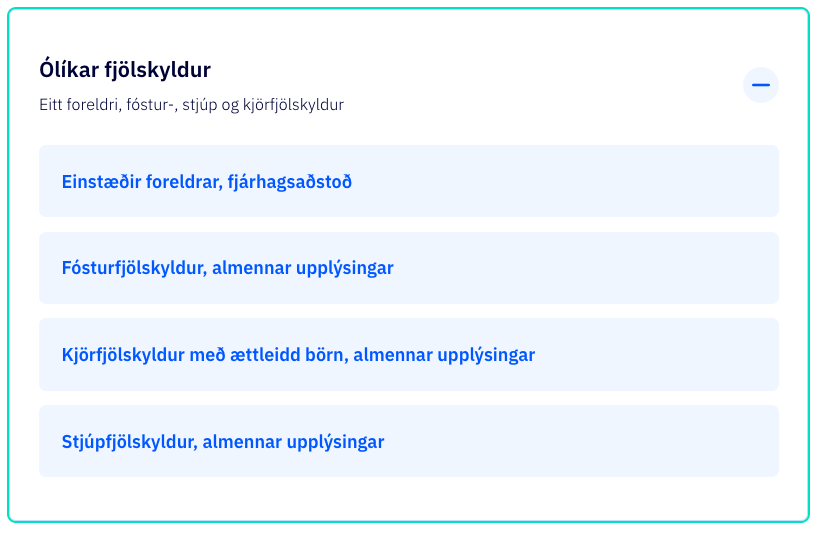
When a group contains many articles, it is recommended to sort them better so that the user can scan through the contents of the group based on the topic. You can create subgroups in the web management system that have the sole purpose of making it easier for the user to find information quickly and efficiently through the web's navigation.
Within each sub-group, the web's articles are arranged in alphabetical order, unless it is specifically chosen to arrange them in a different way.
Avoid repetition
Repetition of content can mislead the user and increases the likelihood that they will look for information in other ways, for example via e-mail or telephone.
The goal with Ísland.is is to eventually create one place where people know they can find the facts about governmental services. This is often referred to as a 'single source of truth'. Repeated content produces worse search results, confuses the user and damages the credibility of Ísland.is.
The number of categories, groups and articles that the user has to choose from each time must be set in moderation. A rule of thumb is to:
limit the number of service categories on the front page to 18. Over time, it will hopefully be possible to further reduce the number or to only publish on the front page the categories that are most relevant to the public.
limit the number of groups in each category to 20 if possible.
limit the number of articles per group to 12 if no subgroups are used. If the number of articles increases, the possibility of subgroups should be considered.
The sorting of articles into groups and subgroups needs to be constantly reviewed. When the content of the website increases, it will be necessary to combine or split up groups according to the scope and nature of the content.
Site map: All articles belong in one specific place on the site map. This location determines the breadcrumb trail of the article.
Navigation: An article can be referenced in more places in the navigation system to help users find the content. The same content can be relevant to different users who search in different categories of the website.
For example, an article about financial aid to families of children with disabilities could belong in the category Family and Welfare / Financial Assistance in the site map, but could also be accessed from the category Poeple with disabilites.
URLs on Ísland.is are designed to be simple, predictable and user-friendly. They follow a specific structure so users can quickly understand how they work.
Most URLs are generated automatically when a new subpage is created in the Contentful web management system.
Sometimes short URLs are created for marketing purposes.
URL structure
Content pages (articles) are without a prefix in the URL - island.is/[page name]
All other site types have a descriptive prefix - island.is/[page type]/[page name]
Types of pages and suggested prefixes:
Navigation:
island.is/en/category/family-and-social-welfare#parental-leave-and-registering-a-childArticles (content pages):
island.is/en/parental-leaveLife Event:
island.is/en/life-events/having-a-babyInstitutional pages:
island.is/en/o/district-commissionerNews:
island.is/en/news/30-agencies-websites-soon-moved-to-island-is
Page titles (H1) should:
be 65 characters or less
be descriptive and distinguish the content of the page from all other pages of the website (can stand alone in search results)
include the main keywords in the front of the title
not contain hyphens or slash marks
not contain a period at the end
be written using the same vocabulary used by users
Example of a descriptive title:
✅ Social work and service centres for senior citizens
🚫 Social work and service centres
Example of a front-loaded title:
✅ Adopting a stepchild under 18 years old
🚫 Important information when adopting a stepchild under 18 year old
Title length
A title should be 65 characters or less.
More than 65 characters may be used if necessary to make the title clearer or unique, but please note that:
Google only uses the first 65 characters and ignores the rest
long titles are more difficult to understand
As a rule, 80% of the users need the same 20% of the information. Our job is to figure out what that 20% is and
have this information at the top of articles/text pages
have these articles at the top of their categories in the navigation system
3. People can understand it
Users enter the web for a specific purpose. There is something they need to know or need to do related to governmental institutions.
Most commonly they are
trying to complete a specific task, for example
- apply for increased child support
- apply for a residence permit
- move legal domicilesearching for information, for example
- when child benefit is paid and how much it is
- on visitation rights of non-custodial parents
- what needs to be done when a person dies
The aim is that each article responds to one defined user need. We need to find out what those needs are.
Example:
A person who wants to adopt their 7-year-old stepchild should not have to scan all the information about foster child adoption or child adoption from abroad. These are very different processes and people need different information to complete these tasks.
→ That's why these are separate articles on Ísland.is.

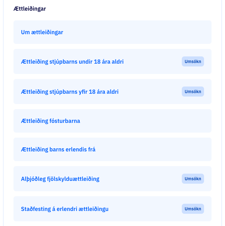
Most web users want to achieve their goal as quickly as possible, with as little effort as possible. People visit a site to find an answer quickly and safely - not to read an essay on the topic.
People scan text instead of reading it. People scan by jumping back and forth on the page, skipping content, and then going back to scan what they skipped.
Scan pattern
There are many known scan patterns.
🚫 F-shape pattern is an example of a bad scan pattern.
✅ Layer-cake pattern is what we are after.

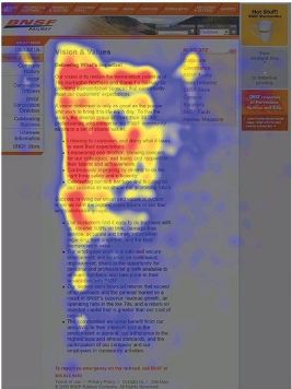
Photo: Nielsen Norman Group
Users spend the most time on the text at the top and left side of the page. Then they jump down and look there for a while, but not with the same concentration as at the top.
As they move down the page, they scan fewer and fewer words per line, forming an F-shaped pattern.
People use this method when they are not interested enough to read every single word and when the text is presented in large chunks without structure.
The F-shaped pattern is bad for users and for the company or institution. Users may miss important information simply because it appears on the right side of the page. Users don't realize this because they don't know what they don't see.
A good text structure reduces the F-shaped pattern.

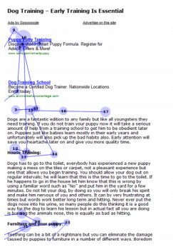
Photo: Nielsen Norman Group
Users look mostly at the title and subheadings until they find a chapter they are interested in, and then they start reading.
This is considered the best way for users to scan pages.
The layer-cake pattern is achieved with
short passages of text
subheadings where keywords are at the front of the sentence
good structure of text to highlight main points, for example with bulleted lists

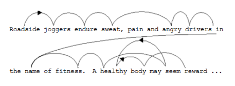
Photo: Microsoft
People don't read text letter by letter. People focus on a word or part of a word, receive
the information, then skip and focus on another word. The brain creates the context that people miss when they skip words, it fills in the blanks.
Short, simple words are easy to predict when the eyes scan. Complex and uncommon words are harder to predict without focusing on them for a while, which slows down reading.
→ Speed up reading by using common words and avoiding legal terms, technical terms and complex words that few people know how to use.
Use the same vocabulary that people use when they discuss the topic with each other. Avoid technical language, legal language and other complicated words that only a few are comfortable using.
Use clear words.
✅ Services for people with disabilities
🚫 Social services
If it is necessary to use a complex term or word, it should be explained when it first appears in the text.
Write the text based on the user and not based on the institution.
✅ The contract can be collected after the official registration
🚫 The contract is handed over after official registration
Personas that represent a few of the user groups of Ísland.is

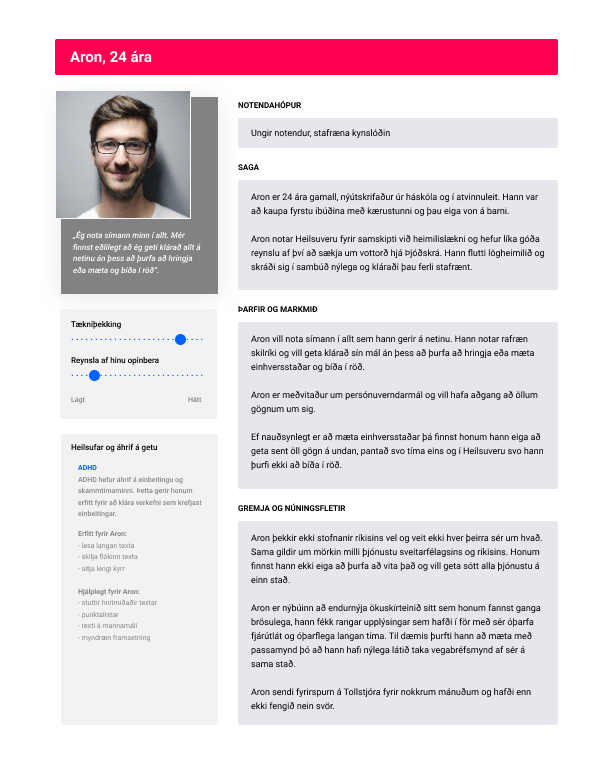

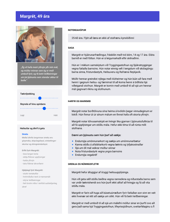

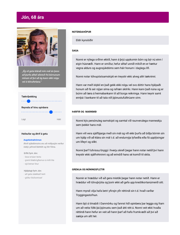

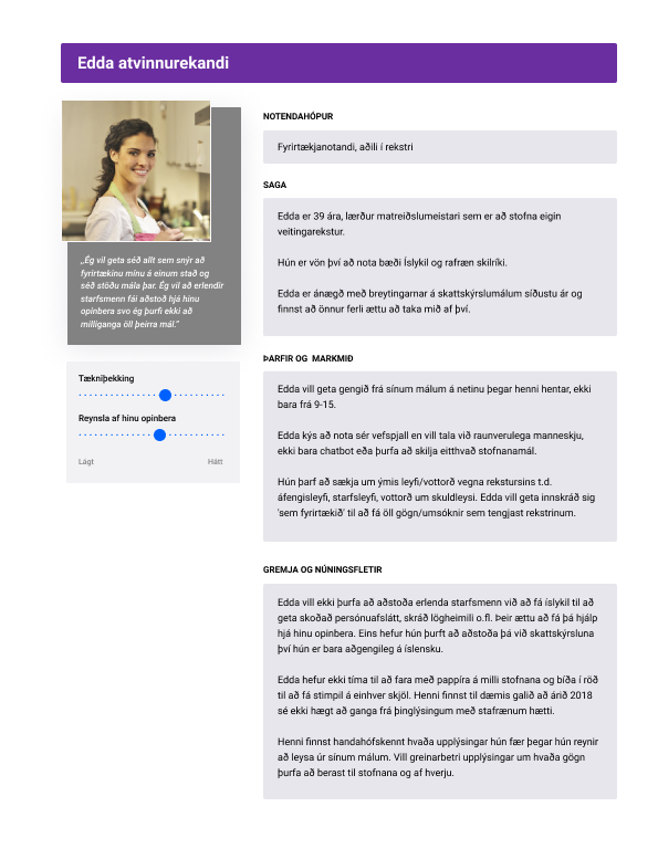

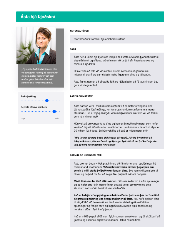
The tone of Ísland.is is positive, warm and clear. We take our role seriously as we are speaking to the nation, 24 hours a day. We need to be aware of our tone of voice, tone and texture of every message wherever we deliver it.
The tone needs to be positive and effortless, without trying to be particularly 'cool'. The appearance must be refined and professional, without being dry and boring. We get straight to the point with the goal of helping people quickly and safely find what they're looking for.
We are:
informative — not complicated
tactful — not pretentious
helpful — not pushy
accurate — not pedantic
positive — not upbeat
We use Icelandic whenever possible. In written language, we avoid slang and technical language (jargon). We do not use emojis. However, they can be used in chat and in more personal communication like online chat.
The text should always be concise and to the point. If detailed explanations are needed in the text, you can refer to supplementary material. This also needs to be kept in mind within the institutions, in presentations, videos, e-mails, reports and other material that passes between employees.
We take care in addressing the genders and use gender-neutral terms. We never talk down to any groups and are aware of users who are not native speakers of Icelandic or who have difficulty reading or understanding it.
Ísland.is — straight to the point
Examples of tone of voice
Informative — not complicated
Now:
Registering a religious or life stance affiliation in the national register does not mean that the National Register of Iceland keeps a separate membership list of religious or life stance affiliations, but is only a matter of recording where the parish fees should go according to the provisions of Act on parish fees no. 91/1987 and the Act on Registered Religious Societies and Life Review Societies no. 108/1999.
Better:
The registration keeps track of where the parish fees go. The National Registry of Iceland does not maintain a separate membership list of religious or life stance affiliations. See the provisions of the law on court fees no. 91/1987 and registered religious associations and religious associations no. 108/1999.
Tactful — not pretentious
Now:
You may only look up by country code, property number or property name.
Better:
You can look up the name of the property, its number or its country code. Helpful — not pushy
Now:
A separate account must be given of its consequences according to Article 9 law on passports.
Better:
Its consequences must be accounted for. See Article 9. law on passports.
Worse:
It is necessary to immediately make a special account of its consequences according to Article 9 law on passports.
Accurate — not pedantic
Now:
The information provided is paid for at a rate that is in effect at any time (licensing fee plus transaction fee) and under applicable law. The invoice will be sent out on a monthly basis.
Better: Invoices are sent out on a monthly basis. Now: Information is paid for under a tariff (licensing fee and entry fee).
Positive — not upbeat
Now:
Was the content on the site helpful?
Worse:
Hi, did you find everything you needed?
Helpful to print out - in Icelandic
Áherslur fyrir efni (pdf)
Gátlisti við efnisskrif (pdf)
Follow-up: Are there a lot of questions on the same subject?
If the helpdesk receives many questions on the same topic, we need to look at what causes the problem and seek to fix what is wrong.
If the content that users need is simply not available on the website, it needs to be improved.
Let's start by defining and justifying the need for it as follows:
AS [user]
I WANT [action]
SO [reason/benefit]
and then make a new article on the website that meets this user need.
Is the content not sorted well enough on the website?
Do we need to move it in the navigation system?
Do we need to make a new reference to it in another class?
Is the title of the article not descriptive enough for the topic?
Make the title more descriptive.
Use the right keywords
Are the subheadings not descriptive enough?
Make the subheading better.
Divide the content more.
Is the text too far down on the article?
Would it be better to rearrange the sections of the article?
Is the wording too complicated?
Simplify it.
Rewrite legal texts and other technical languages that few people are comfortable using.
Shorten paragraphs.
Are we not using the vocabulary that people use?
Learn the words that people use when they talk about the subject. Social media and online forums are good places to meet users.
Is the text too long, are people not bothered to read it to understand it?
Get straight to the point. Have the most sought-after content at the top of the article.
Shorten or divide long texts into smaller sections with good subheadings.
Make it easier for people to read by highlighting the main points with bulleted lists or numbered lists.


Photo: Cybermedian
Style Guide
Guide for writing and managing content for articles on Ísland.is, the service site and chatbot.
Ísland.is - articles/pages
In articles, it is recommended to present information in an organized text with descriptive subheadings (H2, H3, H4). This helps users scan the page and find what they are looking for. The most sought-after information should be at the top of the page.
Users should not have to guess whether the information they are looking for is in general text or in question and answer form elsewhere on the page.
Service pages and chatbot
The service pages can include FAQs for the most common questions from users. That content is then reused for the chatbot.
It is important to base FAQs on real questions from users and that questions and answers are up to date. Too often, FAQs are based on content that someone thinks people need, and not actual common questions.
Redirects are a way to have a specific URL, for example /vinnuskoli2020, automatically direct users to a new URL /vinnuskoli2021.
Redirects are required when changing the URLs of articles because:
people can have an old URL bookmarked in their browser
search engines remember old URL's and they may be displayed at the top of the search result
we do not want people using the site to hit an error page because an old URL is no longer active - unless of course, an article is deliberately removed and no new article replaces it
Use bold print sparingly. Excessive use makes it difficulties for users to recognise which parts of the content they should pay attention to.
To emphasise words or sentence parts, you can use a bulleted list, headings or rephrase it to have the keywords front-loaded in the sentence.
Bold print is useful, for example, when referring to specific parts of the web interface.
Example:
✅ After logging on, select Confirme e-mail address to complete the registration.
❌ The application must include the name and national ID number of the applicant.
Headings should be descriptive, not general.
People scan headings and subheadings in articles to decide whether they are in the right place or not.
People don't read the page from beginning to end, they scan in search of the answers they need.
Subheadings are prominent, and help people quickly identify the content of the site.
People with visual impairments also rely on the correct use of H1, H2, H3 to get around the text. Screen readers jump between these markings in the text and read the headlines until the user finds the right section to listen to.
Bold print does not replace H-markings.

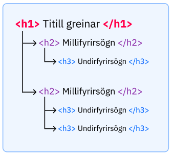
People do not read long passages of text unless their interest in the content is that much greater.
It helps to break up long texts with paragraph breaks.
Avoid writing words in all capital letters.
Words in all capital letters have a uniform rectangular shape, meaning readers can't identify them by their shape, which slows down reading.
Link to a descriptive sentence section.
Example:
✅ Learn more about taxation of rental income on the Tax website.
❌ More information here.
Show e-mail addresses in the text so users can copy or write them.
Not all users have e-mail applications installed on their devices. If the email address is only posted as a link, it will be more difficult for users to see it.
✅ Blær Blöndal, blaer.blondal@sendumerpost.is
❌ Send mail to Blær Blöndal
There are three ways to link documents or processes in an article.
Example:
The document is an application, request, notification or other 'action' that is the center of this article
The document or link to the process is placed at the top of the article (as process entry in the web management system)


The document is important in the article, but not the 'action' that the article is about
The document is displayed prominently in the correct place on the text (embed asset).


The document is supplementary to the content and only useful to some users
The document is inserted as a link asset.


When you refer to the name of the website, write Ísland.is.
For most people, reading legal documents is both complicated and slow. When referring to laws, let's try to rewrite the information in simpler language, using vocabulary that people use.
Put a link to the law library where we think it's necessary, but still remember that the user comes to the website to look for the right information, not to find sources that the information is correct.
Example:
If you cannot exercise your legal rights due to the behaviour of another party, you can go to court and request a court order that the so-called insertion can be carried out. With it, you are introduced to your rights and legal status thus established. More about insertion in Article 73 of the Executive Act no. 90/1989.
Good content scores high on search engines just by being good content, tailored to the needs of users.
Once we know the user groups, the user needs and the vocabulary people use, we can design good content.
Numbered lists
Use numbered lists to guide the user through a certain process.
The steps in the process start with a large letter and end with a dot.
Example:
To receive payments of health day allowance, you must:
Check to see if you meet the payment criteria.
Obtain necessary supporting documents.
Apply for healthcare benefits and submit supporting documents.
Bullet lists
Bulleted lists help to highlight the main points in text and enumerations.
A bulleted list is preceded by an introductory sentence with a colon. A bulleted list is either lowercase or uppercase.
Uppercase and a period when the text is an independent sentence that can stand alone.
Example:
Attachments:
Drawing and description of the area where you want to burn the tendon.
A copy of the reviews and approval of the relevant equipment association.
A copy of the reviews and approval of the relevant fire department.
Lowercase when each item in the list is directly following the sentence above.
Example:
The application must include:
name and national ID number of the responsible person
the purpose of withered grass burning and reasoning for its necessity
how the fire will be limited
Lowercase when the list is a single word.
Example:
Do not burn withered grass where damage may occur to:
natural monuments
birdlife
heath or tree vegetation
Use short, simple paragraphs
Research shows that 90% of people understand paragraphs of 14 words or less. Then comprehension decreases as paragraphs get longer and only 10% of people understand 43-word paragraphs.
Let's try to prevent people from having to read the same paragraph over and over to understand.
Let's keep them short.
Decorative images
An image shall only be used if there is a real need for it. Avoid using unnecessary decorative images.
If a decorative image is used, the alt text shall be empty so that screen readers ignore the image. Do not write "an image of a man with a dog".
Informative images
Make sure that information displayed in images is also accessible to people who cannot see the image. People who use screen readers and other such technology to retrieve information should be considered.
It is a good idea to write the text on the page as if the image is not there, then add the image for people who can see it.
Graphs and graphical representation of data (infogram or powerBI)
Statistics can be published with the help of Infogram or powerBI on Island.is.
With all graphs, it should be well explained in the text of the page what is in the image/graph. The text description is for everyone, the graph is just for people who can see it. Only use alt text if you cannot adequately describe the imagery in the text on the page.
Infogram is only permissible for graphical display of statistics. Price lists, application processes and other content shall be presented in text form on the pages of Island.is.
Use the colours and fonts that can be found in the Island.is design system.
Be clear about who is 'talking' on the web (the institution), to whom (the user) and about other parties involved. This makes it easier for people to understand the content.
You
You can use the first name 'you' in a text and address the reader directly. If the content is intended for multiple user groups, it is a good idea to provide an explanation.
For example:
✅ 'As an applicant, you can…'
✅ 'As a parent, you need to…'
We
You can use the pronoun 'we' in a text if it is completely clear who is speaking. User testing comes in handy here. It is safer to use the name of the institution or the job title of the speaker.
For example like this:
✅ 'The Directorate of Health issues instructions regarding...'
✅ 'District Commissioners throughout the country provide assistance...'
Third party
If a third party is heavily involved in the article, it is important to maintain consistency and always use the same word for that party.
For example like this:
✅ 'During the reconciliation process, it is important that you and the guardian meet with the district commissioner...'
Most of the time there is no need to mention the gender of people in a text.
Try to avoid sentences that contain gendered pronouns or adjectives that take on gendered endings.
No equivalent examples in English.
Use gender-neutral words whenever possible.
No equivalent examples in English.
If there is a discrepancy between the use of words in the law and the words that people use among themselves, let's use the words that people use.
If this causes insecurity for users, refer to the legal word when the word is introduced in the beginning of the article.
Example
'The representative of the company, the legal entity according to the legal text, can apply for a postponement of...'
Use the word Phone or Phone number before the number. Not Number, GSM or Phone no.
Phone number format
Write the phone number with a space in between and not a hyphen. Hyphens make it difficult for those who want to copy the number into a mobile application to call.
✅ 426 5500
❌ 426-5500
Links to phone numbers
Creating a 'tel:' link to a phone number in the text is not recommended.
Most mobile browsers recognize a phone number in the text and automatically turn it into a link that a user can click to make a call.
If the phone number is made as a link in the code, it will also be a link for users on devices that cannot be called from.
It cannot be assumed that all users know abbreviations. Screen readers also do not always read abbreviations correctly. It is safest to omit the abbreviations and write the words in full.
We do not use italics in text on Ísland.is.
To emphasise words or sentence parts, you can use bulleted lists, subheadings or by having the keywords front-loaded in the sentence.
Parenthesis can make paragraphs more complex and difficult to understand. Try to minimize their use, for example by rewording the paragraph so that the content of the parenthesis can stand as an independent sentence.
Parenthesis may be used:
to explain abbreviations of words when they are first introduced,
for references.
Always use (round brackets).
Do not use [square], <angle> or other types of brackets.
When referring to related content, it is a good idea to imagine what the user might want to look at next. Is there an article that is a natural continuation of this one for a large user group?
Try not to fall into the trap of connecting all articles that are subject-related.
We use tables to present data such as numerical information, but we use other ways to control the layout of images and text. Keep in mind that tables are not always the most suitable way to present information.
Instead of a simple table, you can use
sub-headings and bulleted lists
bulleted list using commas to separate items on each row
When the content requires table presentation, it is important to ensure that it is presented in an accessible manner.
It should be kept in mind that many people view the page on a small phone screen and therefore only see part of the board at a time.
Some users rely on screen readers and keyboard shortcuts to move the cursor instead of their sight and a mouse.
It is recommended to have row and column names in bold font to separate them from the content of the table.
All content on Ísland.is should be available in Icelandic and English.
The web management system has a machine translation application that speeds up the translation of content. It is necessary to carefully review the translations to ensure the quality of the content and to teach the machine the correct translations.
Accessibility
The purpose of the accessibility guidelines is to ensure that everyone who works at Ísland.is cooperates in ensuring good access for all users of the website, regardless of disability or equipment.
Managers need to make sure that decisions are made with the needs of all users in mind.
Designers need to make sure that designs are accessible and meet standards.
Developers need to deliver technically accessible solutions.
Webmasters need to make sure that the content is understandable for all users.
Accessibility goals
Ísland.is is an information website that should be accessible to all users and take into account the needs of different groups, such as:
the blind and visually impaired
people with dyslexia
the hearing impaired and deaf
people with physical disabilities
other groups of people with disabilites
the elderly who often have trouble controlling a mouse
people using different devices, assistive devices, and technology to view a web
Often need:
to use speech and/or screen readers
description of footage
head mouse or other device that simulates keyboard functionality
keyboard instead of a computer mouse
simple text, for example easy-to-read language
and other devices, aids and technologies for viewing and using the web
The W3C organization publishes a standard (WCAG) that guides how to make web content accessible to everyone. Websites that conform to the WCAG standard are generally more accessible to search engines and people who want to browse the web on different devices.
The WCAG standard can be found in its entirety on the w3.org website. The material is extremely extensive and not a particularly easy read for beginners.
You can also look at simpler versions of the WCAG list, for example the Center for Persons with Disabilities (webaim.org) has compiled the list into a simpler version.
Examples of accessibility in:
A few examples of things to consider when designing for Ísland.is:
The colour contrast should be according to standards. For example background color vs. text color, links vs text, size etc.
Links must be clearly distinguishable from other text.
Text should never be justified.
Text must have a good spacing of lines and there must be good spacing between paragraphs (according to WCAG, the spacing of lines should be at least 1/2 of the height of the text and the space between paragraphs at 1.5x of the line spacing).
Buttons need to be big enough to be easily clickable.
Semantic markup is used: headings, regions, landmarks, lists, special text
Text labels are associated with form input elements. Related form elements are grouped with fieldset/legend. ARIA labelling may be used when standard HTML is insufficient.
The reading and navigation order (determined by code order) is logical and intuitive
f.x. sidebar menu in left side should be rendered below right side content in html, but then styled to appear on left side. Otherwise screen reader would first read all the content of the left sidebar menu before reading the actual content
All forms should be validated and created based on accessibility needs
ARIA is used, where appropriate, to enhance HTML semantics to better identify the purpose of interface components.
All page functionality is available using the keyboard
Keyboard focus is never locked or trapped at one particular page element. The user can navigate to and from all navigable page elements using only a keyboard.
Provide users enough time to read and use content
Clickable targets are too good size, to avoid fat finger problem
The language of page content that is in a different language is identified using the lang attribute (e.g., <blockquote lang="es">).
ARIA is used appropriately to enhance accessibility when HTML is not sufficient.
Technical presentation of materials
Headings shall be used in a logical order (h1, h2, h3...) like sub-sections in a book, but not based on whether a font is small or large. You must not insert h4 at the top and then h2 below.
Point lists should be presented with ul and numbered lists with ol. Do not start the line with a hyphen and call it a list, the screen reader does not understand such a thing.
Tables should be properly labelled and follow standards, so that the data can be read correctly by the screen reader. For example, see https://webaim.org/techniques/tables/data.
Links pointing to different places must have a different text name.
Printing: Ensures that material is produced normally by printing.
Screen sizes: Make sure that styles do not break due to different screen sizes or technology.
Content design
Accessibility depends heavily on content design. Therefore, it is important to pay special attention to these and to follow Ísland.is content strategy.
For example, the following:
Any kind of indicative text should not take into account the size, shape or location of an object, for example, do not write in the text 'Click the circular mark on the right'.
Material that can be displayed in text form should not be displayed as a picture.
Sentences and paragraphs should not be too long.
Text should never be centered or justified.
Page titles should be descriptive so that the user knows what isto be found there and can distinguish it from other pages on related content.
Ensure that headings are descriptive and not duplicated.
Text on a link by itself should be able to describe what is behind the link in question.
Use of complicated words, legal texts and technical language should be avoided when possible.
Abbreviations are not used on Ísland.is.
It is a good idea to include a phone number or contact information, which people can call when they need help from another human.
Button texts must have a text describing the operation. Send form is better than just Send.
Alt texts
All material that is not text-based, such as pictures, video, tablets or decorations, needs to be labelled correctly or provided with an alt text for screen readers. The text has the same purpose as the image does.
Example: A chart that is important for understanding the content of news should be explained in an alt text read by a screen reader, so that a blind person can get the information that is included.
Videos or broadcasts
It is important to consider before deciding to create a video or live broadcast, whether all users can make use of the content.
Any kind of audiovisual material, such as recordings, must also be accessible in transcript.
Live video or audio should have captioning (according to Level AAA of the WCAG standard).
Tools, checklists and manual
Digital Iceland uses the Siteimprove tool on the web to take out and monitor the quality of the web, such as SEO and accessibility. The main aim is to evaluate accessibility, so developers can test their solutions as they are built and be able to see the same errors that might otherwise arise in Siteimprove's console.
Siteimprove tips can be of three types
Errors (upward sign) - need correction
Warnings (triangle) - needs checking and, preferably, corrections
Reviews (eye) - requires review and approval in siteimprove console
Recommendations are also categorised by level
Level A - minimum requirements
Level AA - intermediate requirements
Level AAA - highest requirements
It should always be an objective to fulfil as high a level of accessibility. The realistic objective should be to achieve Level AA in all respects and Level AAA in as many respects as possible. Errors that are Level A must be fixed and are unacceptable if the site contains errors that are Level A.
More accessibility tools
Checklist
More checklists can be found from, for example Maxability á Indlandi
Web Guides
The website guide, a collaboration project between the Prime Minister's Office and the Association of Local Authorities in Iceland, was first published in 2008 and was updated in 2012 and 2014. In the chapter Accessibility and usefulness is a good summary in Icelandic.
Language for easy reading website
Sources
Árnastofnun. (e.d.). Málfarsbankinn.
https://malfar.arnastofnun.is/Árnastofnun. (e.d.). Ritreglur.
https://ritreglur.arnastofnun.is/Gov.uk. (e.d.). Content design: planning, writing and managing content
Gov.uk. (e.d.). Style guide.
https://www.gov.uk/guidance/style-guide/a-to-z-of-gov-uk-style
Microsoft fræðsluvefur. (2022). The Science of Word Recognition.
https://learn.microsoft.com/en-us/typography/develop/word-recognitionNielsen Norman Group. 2020. How People Read Online: New and Old Findings.
Nielsen Norman Group. 2020. Information Scent.
https://www.nngroup.com/videos/information-scent/Peter van Grieken. (2019). Content discovery on a budget. Content Design London.
https://contentdesign.london/content-design/content-discovery-on-a-budget-by-peter-van-grieken/Sarah Richards. (2017). Content Design. Content Design London. London, UK.
Sarah Richards. (2013). FAQs: why we don´t have them. Government Digital Service blog.
https://gds.blog.gov.uk/2013/07/25/faqs-why-we-dont-have-them/Sarah Richards, Lizzie Bruce. (2019). Readability Guidelines handbook 2019. Content Design London. London, UK.
Vefur samtakanna 78. (e.d.) Leiðbeiningar um kynskráningar.
https://samtokin78.is/um-samtokin-78/leidbeiningar-um-kynskraningar/